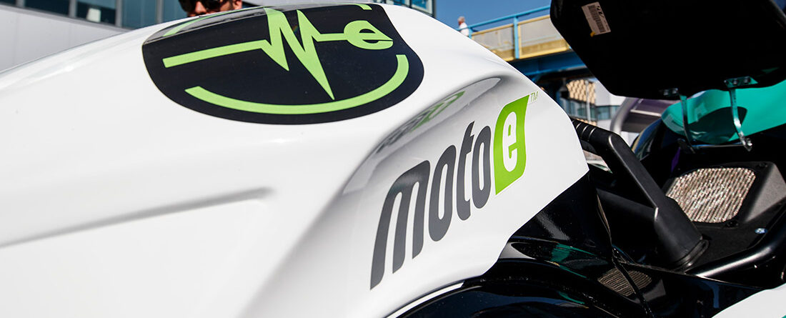
THE ITALIAN ELECTRIC MOTORCYCLE MANUFACTURER OFFICIALLY UNVEILED ITS NEW BRAND DESIGN AT MOTOGP MOTUL TT ASSEN.
Energica is thrilled to announce a refreshed corporate logo that supports the purpose, values and culture for the future of the Italian manufacturer.
The new logo is part of a corporate rebranding aimed to renew the identity of the company in view of the upcoming racing experience as single manufacturer for FIM Enel MotoE™ World Cup.
The historical logo enclosed within the green ellipse has been replaced after 7 years, and the new one was revealed during the demo lap of the Ego Corsa at MotoGP Motul TT Assen.
Becoming a leading voice of EV’s market and being part of a new era of professional two-wheeled motorsport, Energica’s goal was to reinvigorate the identity paying close attention to the iconic “E” symbol.
Energica’s new logo has been modernized to reflect, yet maintain the integrity of the key elements of the original version, such as the “electric beat” symbol displayed in the upper fairing of each Energica motorcycle.The classic outline of the lettering was redrawn with a more outlined version that still stays true to the original design.
The new corporate brand reflects a modern and aggressive look that identifies with the company in the motorcycle global industry.
“Energica Motor Company has changed over the years, it has been able to evolve and write a new and important chapter in the automotive world and now also in motorsports being the single manufacturer for next FIM Enel MotoE™ World Cup”.
“From now on, people will be able to feel this change through a new design” said Livia Cevolini, CEO Energica Motor Company S.p.A.
“The electric beat symbol has always been an icon of our history and our soul and clearly stands for the promising future from Energica. It still stands as a symbol of highest technology and quality, expertise, reliability, disruptive spirit; it stands for trust so far.”
